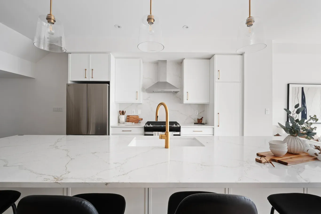
Paint color shapes perception before furniture or décor makes an impact. It defines mood, influences spatial awareness, and frames every other design element within a property. Home stagers rely on color not as decoration, but as a calculated decision that supports buyer engagement.
A well-chosen palette creates cohesion, highlights architectural features, and establishes a neutral foundation that appeals to a wide audience. Poor color choices, however, can distract, overwhelm, or limit a buyer’s ability to visualize the space as their own.
Why Paint Color Directly Impacts Buyer Perception?
Buyers react to color on both visual and emotional levels. Light tones can create openness, while darker shades may introduce depth or intimacy. Each choice influences how a room feels and how large or small it appears.
Color also affects how clean and well-maintained a property looks. Fresh, balanced tones signal care and readiness, while outdated or overly bold colors can create hesitation. Buyers often associate color choices with the overall condition of the home, making this decision critical in staging.
Establishing a Neutral Foundation That Appeals Broadly
Neutral colors form the backbone of effective staging. They provide a versatile canvas that allows buyers to imagine their own style within the space. Neutral does not mean dull; it means balanced and adaptable.
Common neutral tones include:
- Soft whites that reflect light and enhance brightness
- Warm beiges that create comfort without heaviness
- Light grays that offer a modern and clean appearance
- Subtle greige tones that blend warmth and coolness
These shades reduce visual noise and allow architectural features and furnishings to take center stage.
Reading Natural Light Before Selecting Paint
Lighting conditions influence how paint appears more than any other factor. The same color can shift dramatically depending on exposure, time of day, and surrounding elements.
Key considerations include:
- North-facing rooms often require warmer tones to offset cooler light
- South-facing spaces can handle cooler shades due to strong natural light
- Limited light areas benefit from lighter colors that enhance brightness
- Artificial lighting can alter undertones and intensity
Evaluating light ensures that chosen colors perform as intended throughout the day.
Using Undertones to Create Harmony
Every paint color carries an undertone that affects its interaction with other elements. Ignoring undertones can lead to clashing combinations, even when colors appear similar at first glance.
Common undertone categories include:
- Warm undertones with hints of yellow, red, or beige
- Cool undertones with blue, green, or gray influences
- Neutral undertones that balance both
Matching undertones across walls, flooring, and furnishings creates a cohesive environment that feels intentional and refined.
Balancing Consistency Across the Entire Property
Consistency in color selection strengthens flow from room to room. Abrupt changes can disrupt the visual experience and make spaces feel disconnected.
To maintain consistency:
- Use a primary base color throughout the main areas
- Introduce slight variations within the same color family
- Avoid drastic contrasts between adjacent rooms
- Ensure transitions feel smooth and natural
A unified palette enhances the perception of space and continuity.
Creating Visual Expansion Through Color
Paint color can alter how large or small a space appears. Strategic use of lighter shades can make rooms feel more open, while darker tones can define specific areas when used carefully.
Techniques for visual expansion include:
- Painting walls and ceilings in similar tones to reduce boundaries
- Using lighter colors in smaller rooms to increase perceived size
- Avoiding heavy contrasts that break visual flow
- Extending wall color into adjacent spaces for continuity
These approaches help maximize the perceived value of the property.
Highlighting Architectural Features with Subtle Contrast
Color can emphasize architectural details without overwhelming the space. Subtle contrast draws attention to features while maintaining balance.
Effective methods include:
- Using slightly darker tones on trim or molding
- Highlighting built-in elements with complementary shades
- Keeping contrast minimal to avoid distraction
This approach enhances character while preserving a clean, cohesive look.
Avoiding Overly Trend-Driven Choices
Trends can influence color selection, but excessive reliance on current styles can limit long-term appeal. Buyers often prefer timeless palettes that allow flexibility.
To maintain balance:
- Incorporate trends through accents rather than main wall colors
- Choose shades with lasting appeal
- Avoid highly specific or bold color statements
Timeless choices support broader buyer interest and reduce resistance.
Coordinating Paint with Flooring and Fixtures
Paint does not exist in isolation. It interacts with flooring, cabinetry, countertops, and fixtures. Coordination ensures that all elements work together seamlessly.
Consider the following:
- Match warm wall tones with warm wood finishes
- Pair cool colors with modern materials such as metal or stone
- Avoid conflicting undertones between surfaces
- Use neutral tones to bridge different materials
Harmony across elements strengthens overall presentation.
Choosing Finishes That Enhance Durability and Appearance
Paint finish affects both appearance and practicality. Different finishes suit different areas based on usage and lighting.
Common finishes include:
- Matte or flat for low-traffic areas and ceilings
- Eggshell for living spaces with moderate durability
- Satin for kitchens and bathrooms where moisture resistance matters
- Semi-gloss for trim and doors to highlight details
Selecting the right finish ensures both visual appeal and functionality.
Testing Paint Colors Before Final Application
Testing prevents costly mistakes and ensures accurate results. Colors can appear different on small swatches compared to full walls.
Effective testing involves:
- Applying samples on multiple walls
- Observing color at different times of day
- Comparing with existing elements
- Evaluating under both natural and artificial light
This process confirms that the chosen color meets expectations.
Using Accent Walls with Caution
Accent walls can add interest when used sparingly. However, they can also disrupt balance if not executed carefully.
Guidelines for accent walls include:
- Selecting subtle variations within the same color family
- Avoiding overly bold or dark contrasts
- Ensuring the accent complements the overall palette
A restrained approach maintains cohesion while adding depth.
Adapting Color Choices to Property Style
Architectural style influences appropriate color selection. Aligning paint choices with the property’s character enhances authenticity.
Examples include:
- Traditional homes benefit from warm, classic tones
- Modern properties favoring clean, neutral palettes
- Transitional spaces blend both styles with balanced hues
This alignment reinforces design integrity and appeal.
Enhancing Emotional Appeal Through Color
Color influences emotional response. Warm tones can create comfort, while cooler shades can evoke calmness and clarity. Selecting the right balance supports the desired atmosphere.
Consider emotional impact when choosing colors:
- Soft neutrals for relaxation and comfort
- Light, airy tones for openness
- Balanced hues that avoid extremes
These choices help create an environment that resonates with buyers.
Managing Exterior and Interior Color Relationships
Exterior colors set expectations before buyers enter the home. Interior palettes should complement this initial impression to maintain consistency.
To achieve alignment:
- Reflect exterior tones within interior accents
- Maintain a cohesive transition from outside to inside
- Avoid drastic shifts that feel disconnected
Consistency strengthens the overall experience.
Addressing Imperfections Through Strategic Color Use
Paint can minimize visual flaws when applied thoughtfully. Lighter tones can soften uneven surfaces, while consistent color application reduces distractions.
Strategies include:
- Using uniform colors to hide minor imperfections
- Avoiding high-gloss finishes on uneven walls
- Selecting tones that reduce shadow emphasis
These techniques improve overall presentation without major renovations.
Supporting Marketing Through Color Choices
Color plays a significant role in property marketing. Listing photos rely heavily on visual appeal, and well-chosen paint enhances these images.
Professionals working with Toronto staging services often prioritize neutral, photogenic colors that translate well across digital platforms. Consistent palettes ensure that images appear clean, bright, and inviting, increasing buyer interest before in-person visits.
Maintaining Freshness Throughout the Selling Process
Fresh paint must remain consistent from listing to final viewing. Wear and minor damage can reduce impact over time.
To maintain quality:
- Address scuffs or marks promptly
- Keep high-traffic areas clean
- Ensure consistent color across touch-ups
Ongoing maintenance preserves the intended impression.
Elevating Perceived Value Through Thoughtful Color Selection
Color influences how buyers perceive value. A cohesive, well-executed palette suggests attention to detail and care. This perception can support stronger offers and faster decisions.
Thoughtful color selection does more than improve appearance. It reinforces quality, enhances space, and creates an environment that feels ready for occupancy.
FAQs
1. Why is neutral paint preferred in home staging?
Neutral paint appeals to a wide range of buyers by creating a versatile backdrop. It allows individuals to imagine their own style within the space without distraction. Neutral tones also enhance brightness and make rooms feel larger and more cohesive, supporting a positive viewing experience.
2. How do lighting conditions affect paint color?
Lighting significantly changes how paint appears. Natural light can enhance or mute tones, while artificial lighting may alter undertones. Evaluating colors under different lighting conditions ensures that the chosen shade maintains consistency and supports the intended atmosphere throughout the day.
3. Should every room use the same paint color?
Using a consistent base color across main areas creates flow and cohesion. Slight variations within the same palette can add interest without disrupting continuity. Avoiding abrupt changes helps maintain a seamless visual experience throughout the property.
4. What mistakes should stagers avoid when choosing paint?
Common mistakes include selecting overly bold colors, ignoring undertones, and failing to test samples. These issues can lead to mismatched elements and reduced buyer appeal. Careful planning and testing prevent these problems and ensure a polished result.
5. Can darker colors work in staging?
Darker colors can work when used strategically, such as on accent walls or in larger spaces with ample light. However, overuse can make rooms feel smaller and less inviting. Balance and moderation remain essential when incorporating deeper tones.
6. How important is paint finish in staging?
Paint finish affects both appearance and durability. Matte finishes hide imperfections, while satin or semi-gloss finishes provide durability in high-traffic areas. Choosing the appropriate finish ensures that the space looks refined and remains functional throughout the selling process.
7. Should stagers follow current color trends?
Trends can influence choices, but relying heavily on them may limit appeal. Timeless colors tend to attract a broader audience and maintain relevance. Incorporating subtle trend elements without dominating the palette offers a balanced approach.
8. How can painting improve small spaces?
Light, neutral colors can make small spaces feel larger and more open. Consistent color across walls and ceilings reduces visual boundaries. Avoiding strong contrasts helps maintain flow and enhances the perception of space.
9. Why is testing paint samples necessary?
Testing ensures that colors appear as expected in the actual environment. Factors such as lighting, surrounding materials, and room size can alter perception. Applying samples on walls and observing them at different times prevents unexpected results.
10. How does paint color influence buyer decisions?
Paint color shapes first impressions and emotional responses. A cohesive, well-chosen palette creates a sense of comfort and quality. Buyers often associate fresh, balanced colors with a well-maintained property, which can support stronger interest and quicker decisions.